

Minnesota Timberwolves unveil 2022-23 City Edition uniforms

Minnesota Timberwolves unveil 2022-23 City Edition uniforms
The Minnesota Timberwolves have unveiled the designs of their NBA City Edition uniforms for the 2022-23 season. In partnership with Nike, the National Basketball Association (NBA) debuted custom uniforms for each team for the season. The Timberwolves' campaign is, "Own Every Canvas," celebrating the intersection of "court + community + culture" and its impact throughout the state of Minnesota.
(FOX 9) - The Minnesota Timberwolves' annual "City Edition" jerseys had just gone on the shelves in the Target Center team store. And John Adams-Meade was there to pick one up.

"I’m curious to see what people's reactions are going to be towards it," he told FOX 9. "I like it. Yeah, I kind of like it."
The Timberwolves have had several years of the "City Edition" jerseys, several of them with rave reviews, notably last year’s tree-lined nod to Timberwolves legacy and a purple Prince-themed jersey after the superstar’s death.
But, after leaking online earlier this fall, the 2022-23 version had mixed reactions from fans, who weren’t sure about its colored rectangles across the chest of a white jersey.
"I think it’ll grow on a lot of people," noted Adams-Meade. "I also like that if you look at a lot of the player’s jerseys, this part is not the same. Every jersey, each player’s jersey, has different variations of where the colors are at and stuff. I think that’s pretty cool."
What may cause the design to grow on people is its backstory. And its purpose.
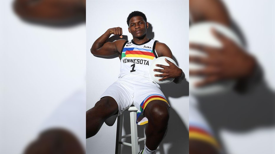
Anthony Edwards models the designs of the Minnesota Timberwolves' NBA City Edition uniforms for the 2022-23 season.
"This process is two years in the making collaboratively with the NBA and Nike," explained Mike Grahl, the Timberwolves' Chief Marketing Officer.
The idea this time was to celebrate the culture of arts that is so rich in Minneapolis. The white jersey represents a painter’s canvas. The colors stretched across the chest are pulled from the team’s history.
"They are deep within our team DNA, pulled from previous logos and marks that we’ve had, as well as uniforms of the past," said Grahl.
The blues and grays come from the first logo of a wolf on a basketball, while the red and yellow are accents in the second that featured a snarling wolf behind a line of evergreens.
To help launch the jersey and its mission to promote local artists, the team released a video made in collaboration with "Public Functionary," a Minneapolis-based studio and artist program. And to further extend the celebration of art, the team will feature local artists during home games that feature the jersey. The floor will also change for those games to complete the tie in to the theme.
"The cultural impact it has, that sports and art both have, they’re kind of universal languages that evoke emotion and inspire generations and kind of create memories, too, along the way," said Grahl.
While the look of the jersey very much evokes the colored panels that have graced the Cedar-Riverside high rises since the 1970s, Grahl said that is just a coincidence.
What is very much on purpose, though, is the font used for the names and numbers. It’s based on a well-known art-deco building in downtown Minneapolis.
The team wouldn’t say which one. But look to the top of the Foshay Tower, and you’ll find a very close match.